

Boer develops font for dyslexics
Dutch graphic designer offers new font downloads for free
Christian Boer, a Dutch graphic designer, developed the Dyslexie font for people with the learning disability, dyslexia.
December 8, 2014
Christian Boer, 33, began to develop the Dyslexie font as a final thesis project when he attended the Utrecht Art Academy. Boer began the project because he also suffered from dyslexia, and he wanted to make reading for dyslexics easier.
“It’s like a wheelchair,” Boer said when describing the font.
It’s meant to serve as an aid to people with dyslexia and make reading easier for them.
“I do notice a difference immediately,” AP Government teacher Michelle Lux said, after experiencing the font. Lux is one of several people on campus who has dyslexia.
The font has the potential to bring relief to up to 20% of the U.S. population who experiences symptoms of dyslexia.
“Growing up, I hated reading,” Lux said. “I didn’t learn I had dyslexia until I was in college, and even then, it took me a while to adjust. We [people with dyslexia] have to learn to read differently.”
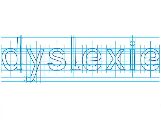
Dyslexie uses a heavier line thickness to emphasize the bottom of most characters. This is to try and ‘anchor’ the letters since some people with dyslexia may see letters either moving or in three dimensions. Since dyslexics tend to get b, d, p, and q mixed up, it also emphasizes a slight slant downwards on the curvature of the letters.
“I hope that this promotes awareness about dyslexia in the future,” Lux said.
To download the font, visit http://www.dyslexiefont.com/en/. Boer offers downloads of the font for free.